Keepsake Studio
Visual identity
Photo editing
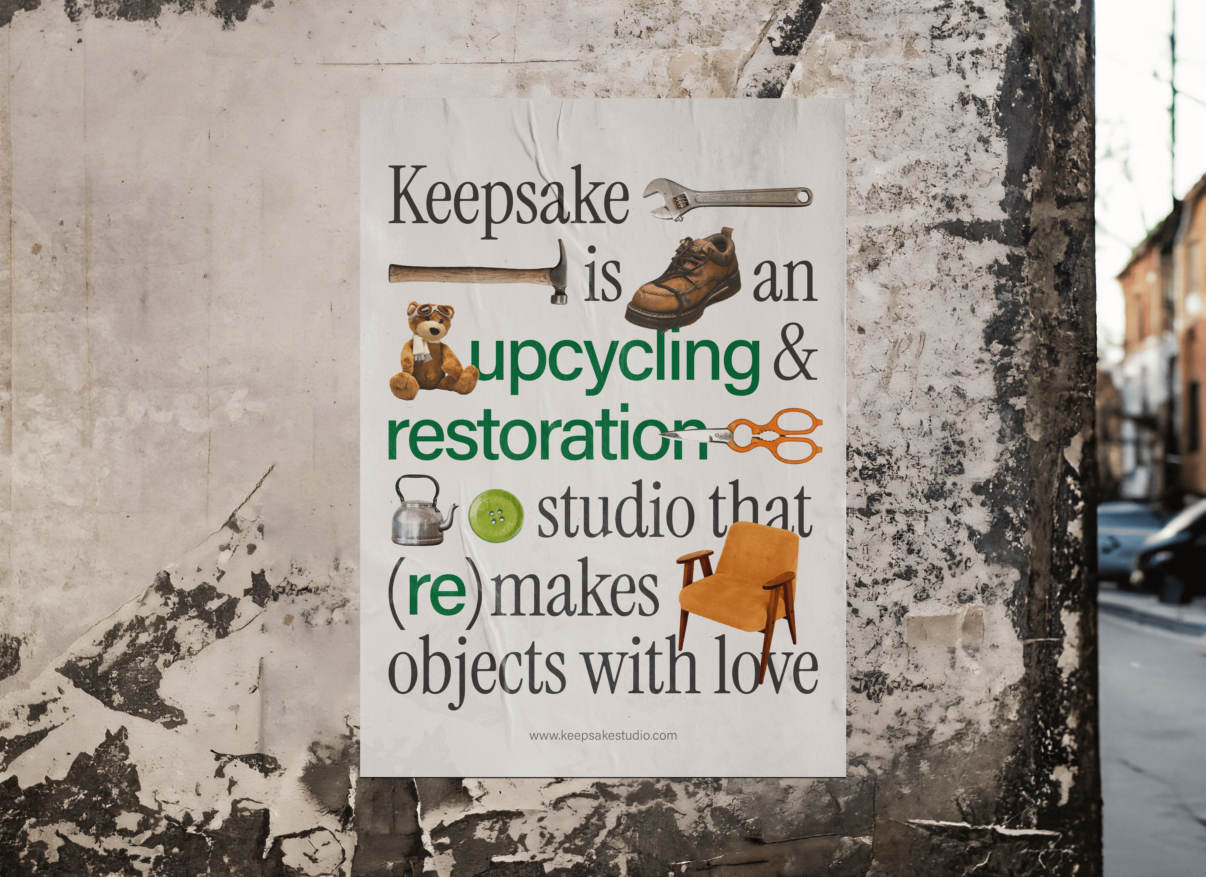
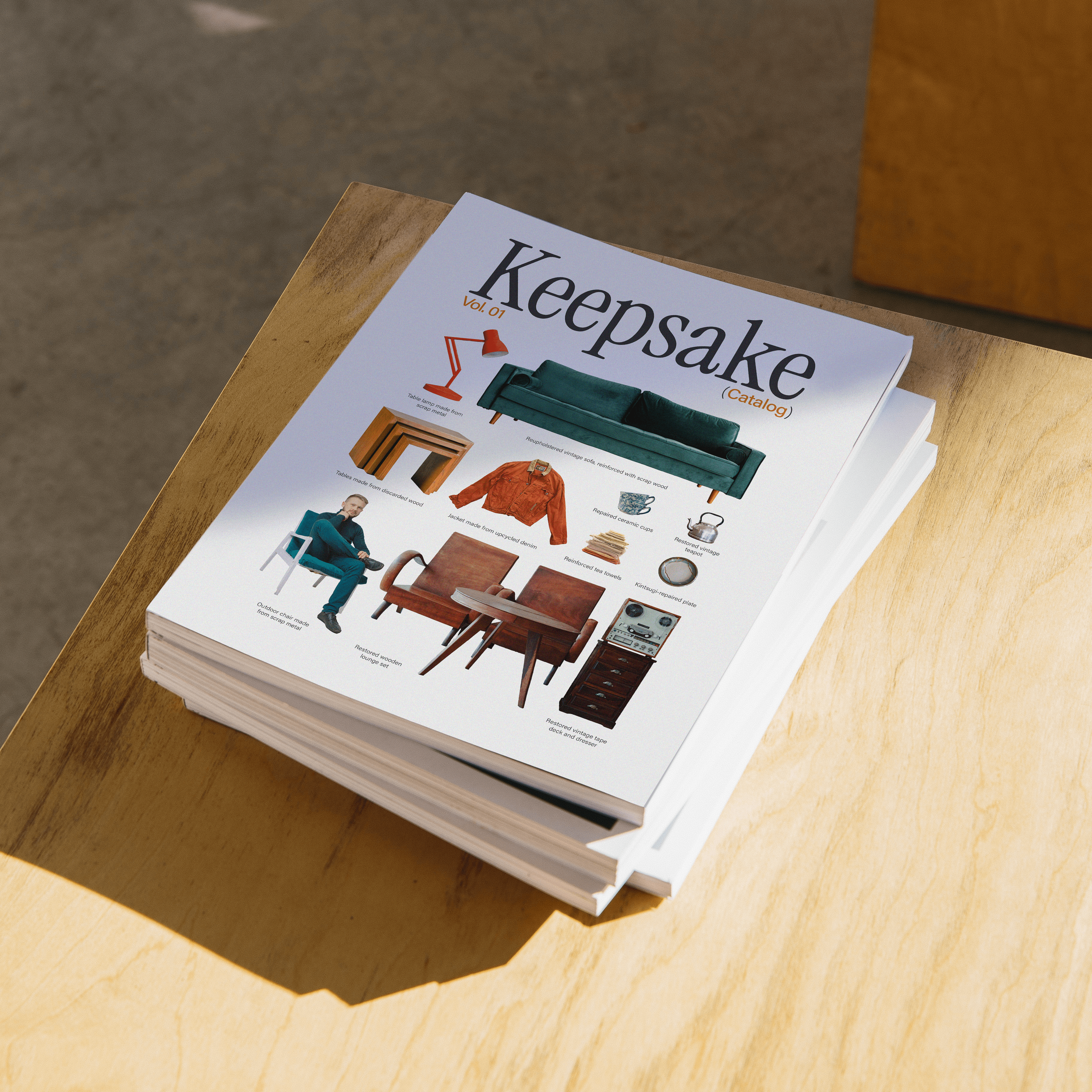
An experimental visual identity for Keepsake, a (fictional) creative studio that offers professional upcycling and restoration services, a community workshop space, and crafting classes for the public.
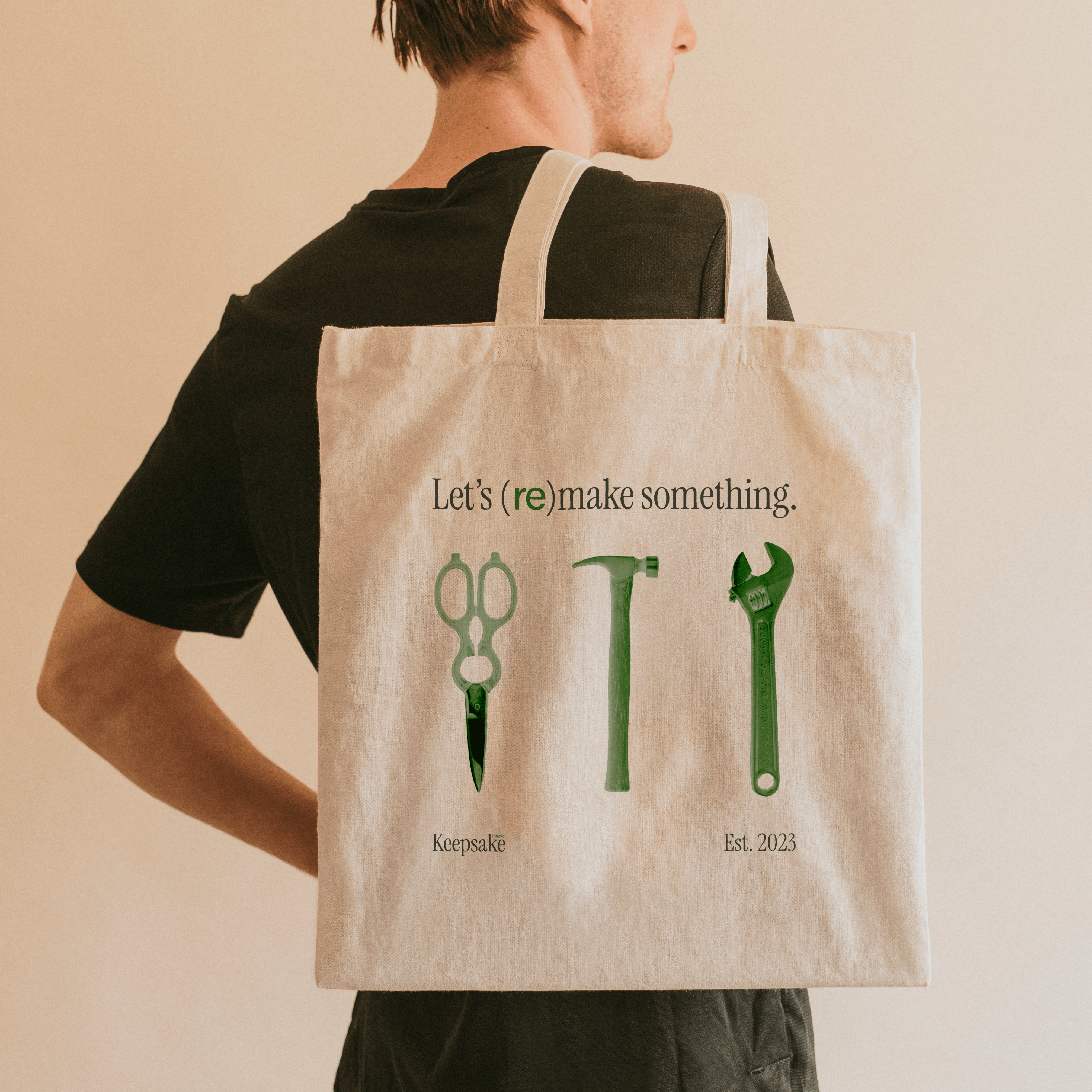
Keepsake’s mission is to promote sustainable attitudes and caretaking practices towards material belongings. As such, the visual identity is based on the juxtaposition of new and old — of material making and continued remaking.
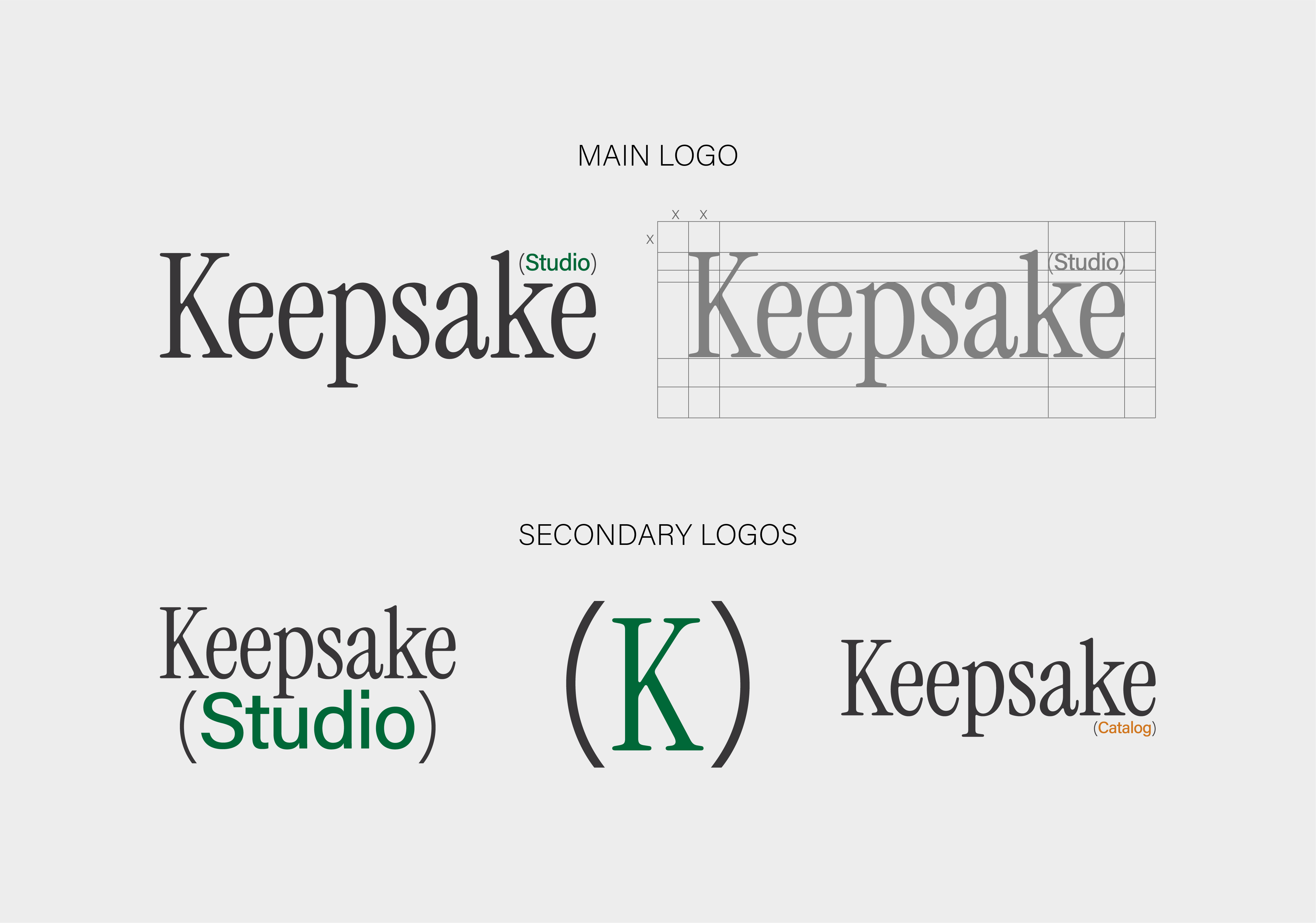
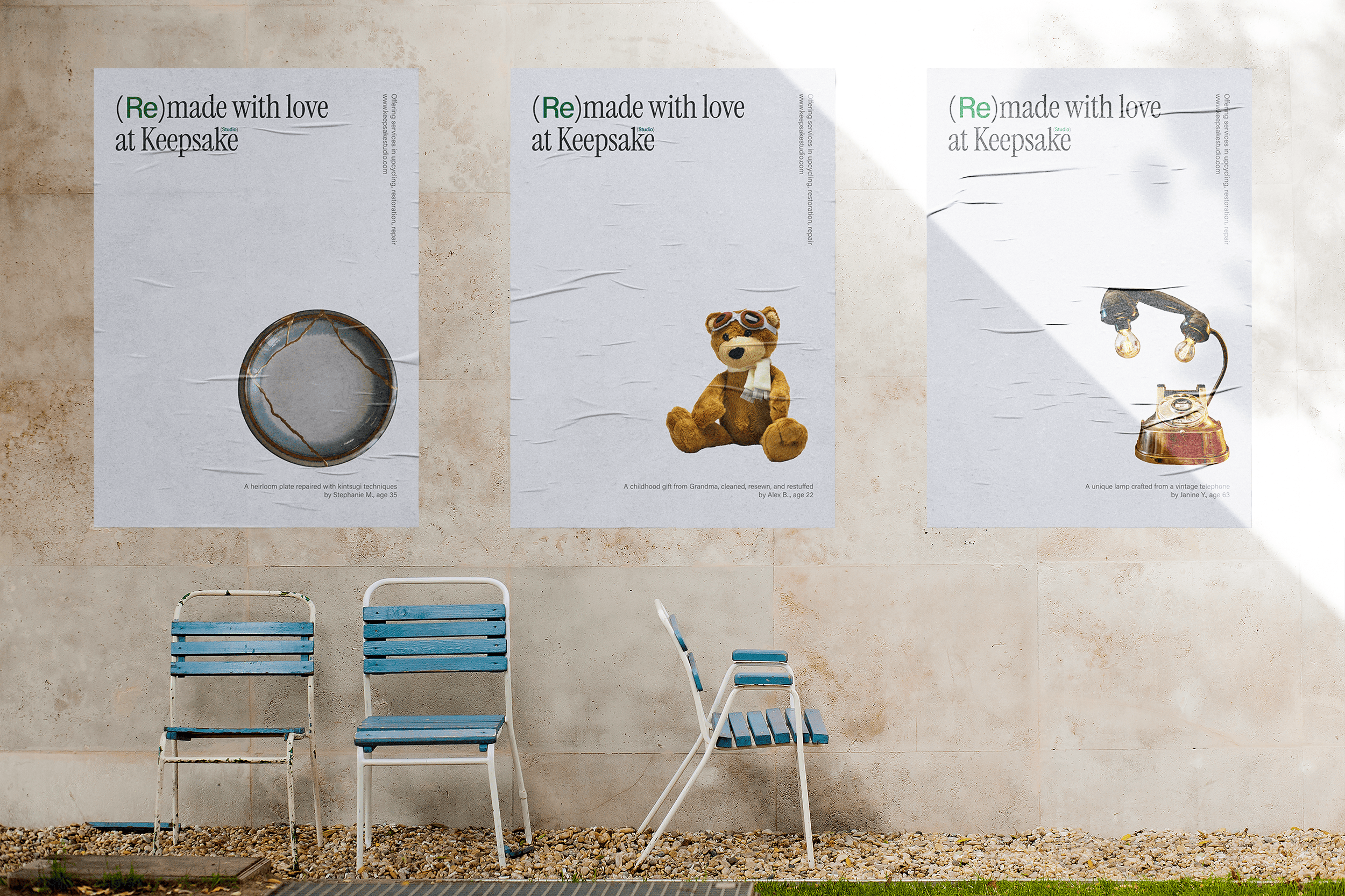
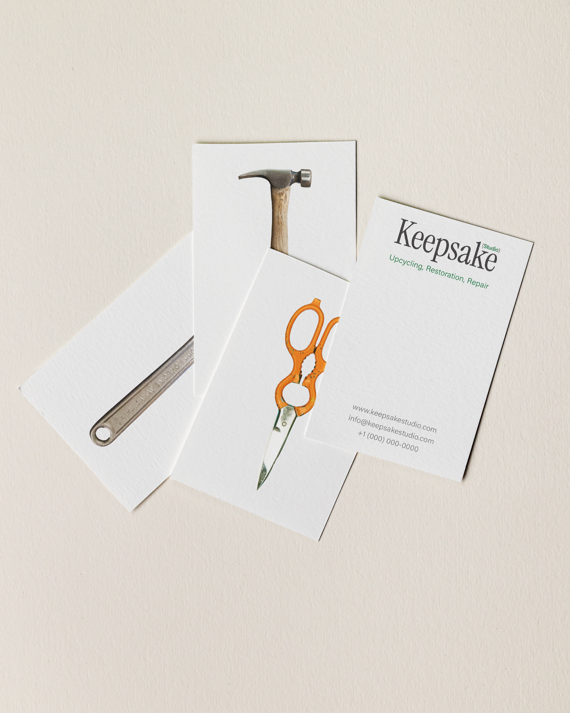
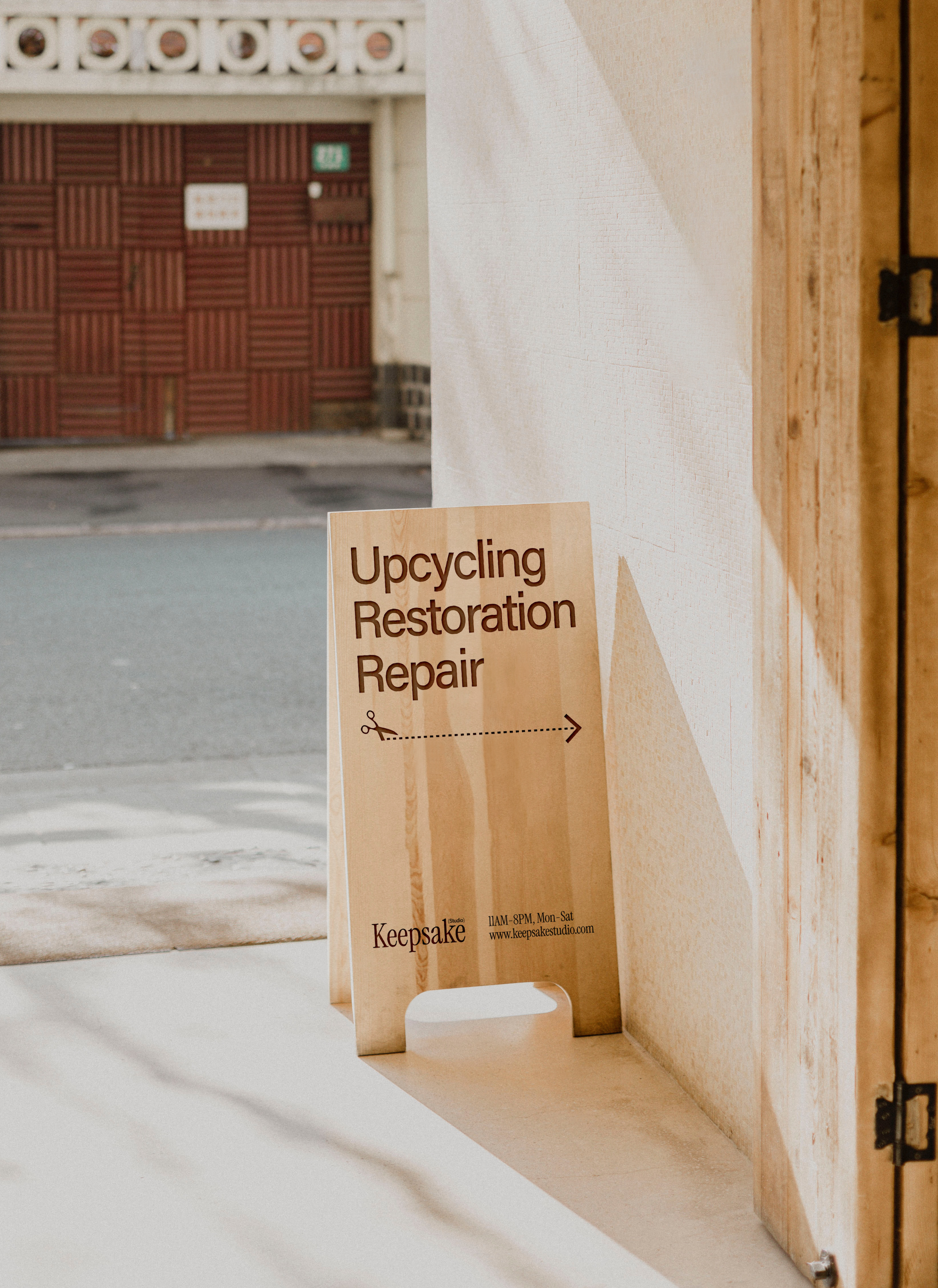
One way this is expressed is in the paired fonts, which together evoke the sense of simultaneous modernity and timelessness within the organization’s premise. Another is the parentheses around the prefix “re” in “remaking,” which suggest a blurred line between an object’s initial creation and the multiple transformations it can undergo throughout its lifespan. It is both a grammatical choice and a broader visual motif that emphasizes the brand values of reuse, repetition, and circularity.
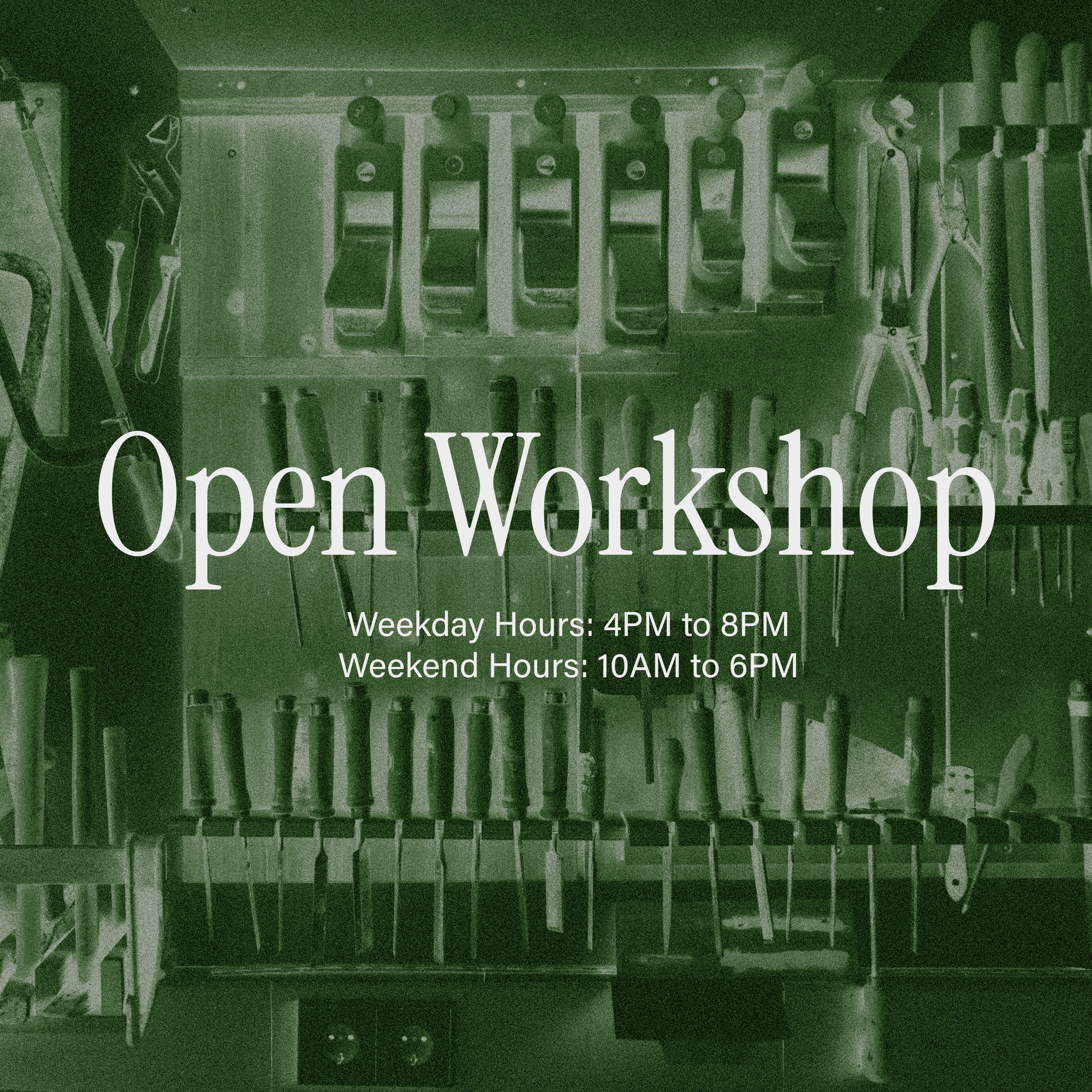
Across brand communications, the visual identity primarily utilizes photographs of altered or restored objects. Some of the photographs function as additional visual motifs, such as the work tools. Others are either examples of student projects or the studio’s professional work. Overall, attention is purposely focused upon the featured objects’ imperfections and unique qualities, which Keepsake aims to embrace and celebrate.